Just Salad
Reclaiming Category Leadership with Craveworthy Sustainability
In a category dominated by unhealthy convenience, Just Salad reimagined what a quick-serve restaurant could be by offering accessible, fresh, plant-centric meals in busy business districts. Since 2006 the chain has grown to over 70 locations worldwide while pioneering best-in-class sustainability measures. It’s home to the world’s largest restaurant reusable bowl program and was the first U.S. restaurant chain to carbon label its menu. And yet, for all its incredible standards – not to mention a delicious menu – Just Salad was not being seen as the category leaders they are.
They engaged BBMG to help them elevate the emotional core of their brand purpose and push their creative boundaries to differentiate the brand identity, fuel customer growth and loyalty, and make them the go-to choice for everyday health enthusiasts for whom taste is as important as doing right by the planet.
The relaunch campaign saw a 3x return on investment with traffic to retail locations up and maintaining. Sales increased +57% in 2023 reaching $120 million, and their 100th location is set to open in 2025.
The Just Salad rebrand won gold in the 4th Annual Anthem Awards in the Sustainability, Environment & Climate category for campaigns & branding and received Silver in the 2024 Davey Awards for brand identity.
![]()

Audience Research
Brand Strategy
Brand Voice and Messaging
Brand Identity
Photography
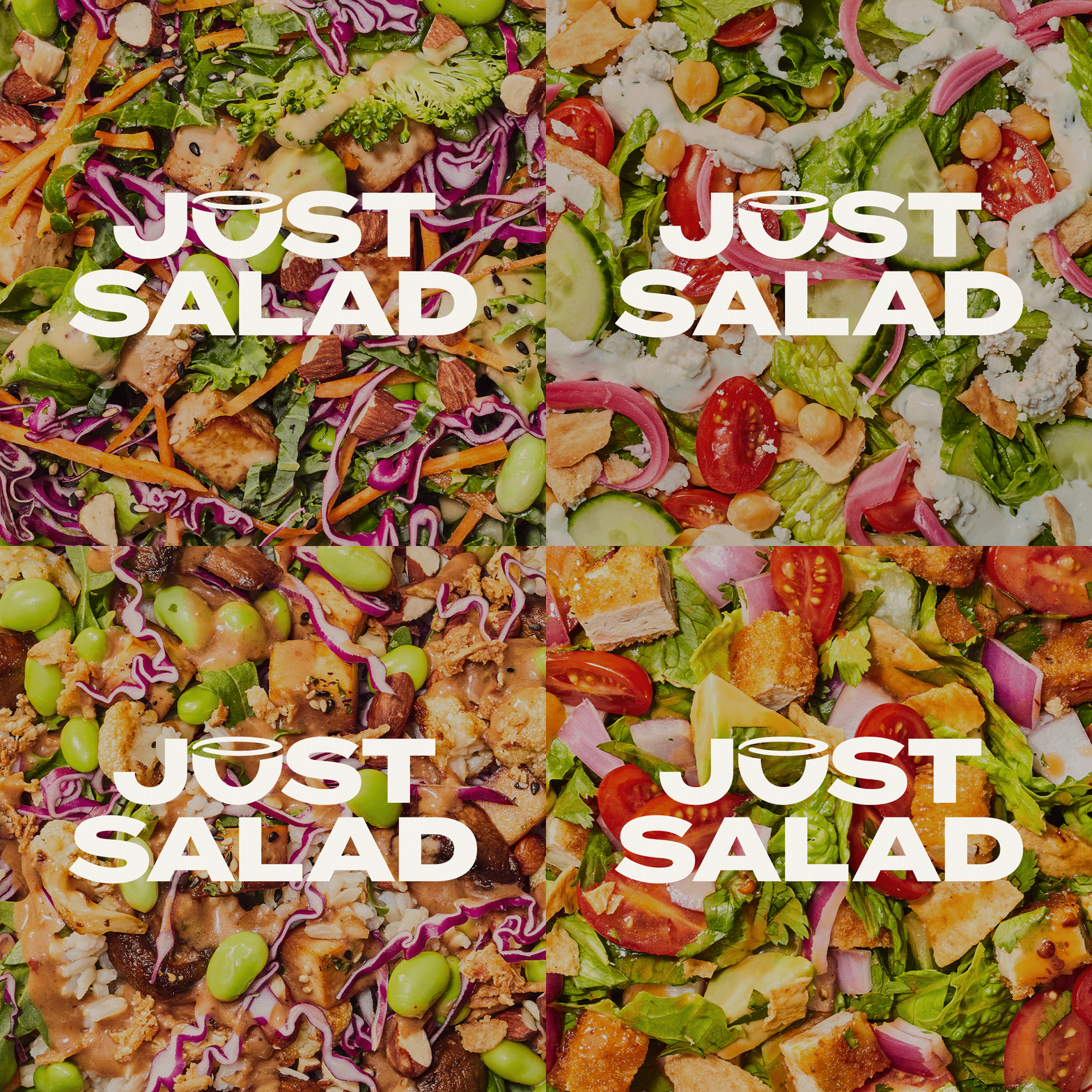


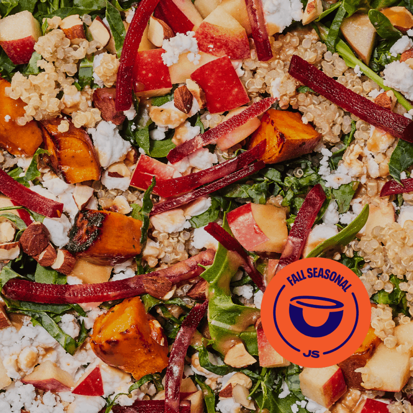
Can’t. Not. Eat. It. All.
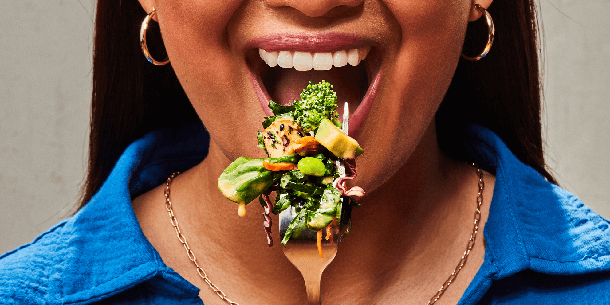
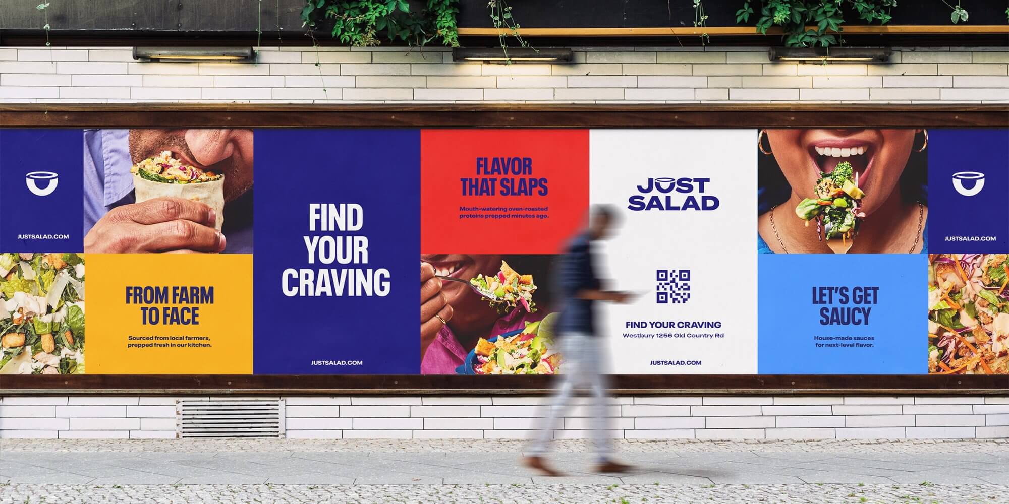
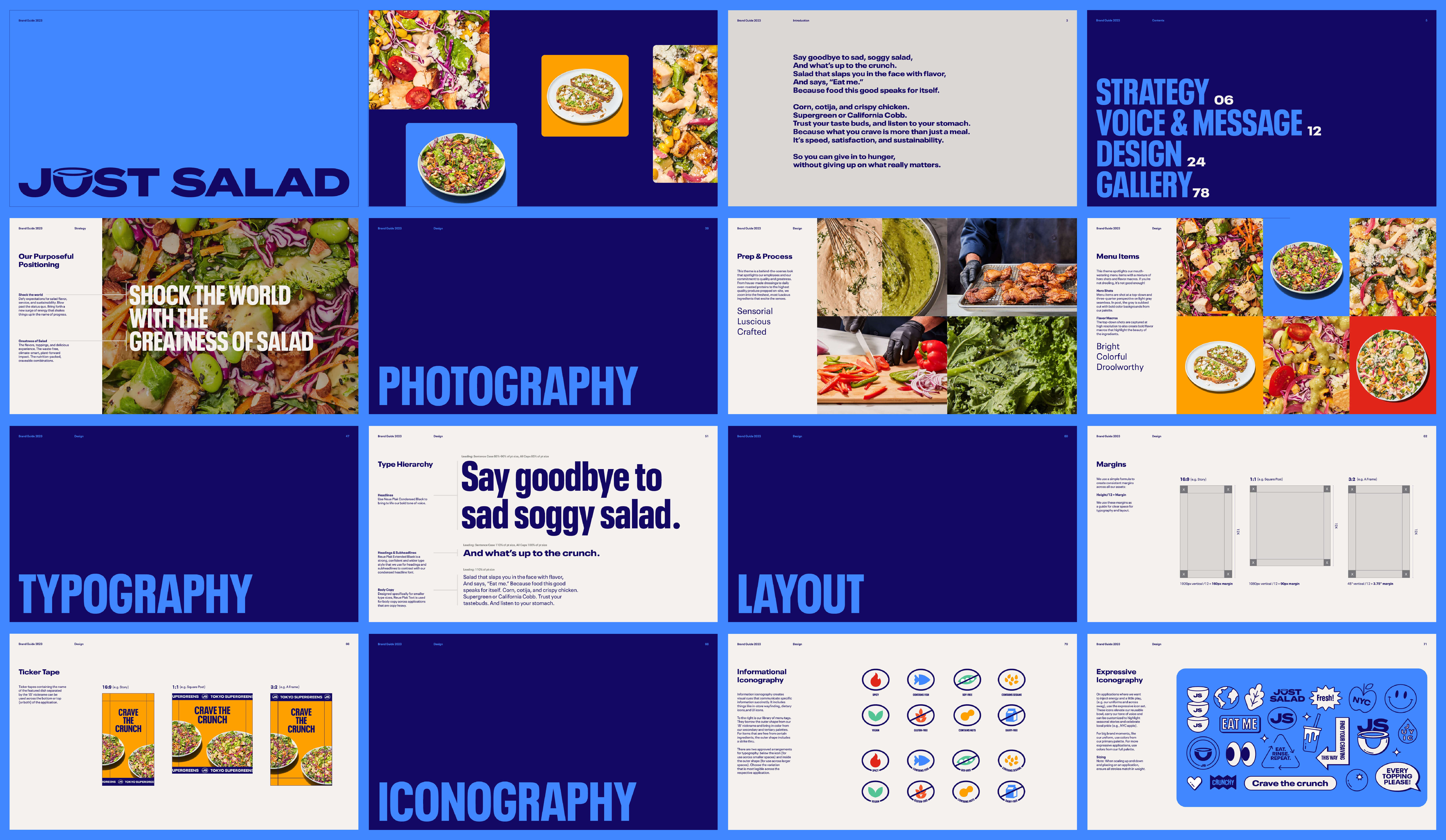
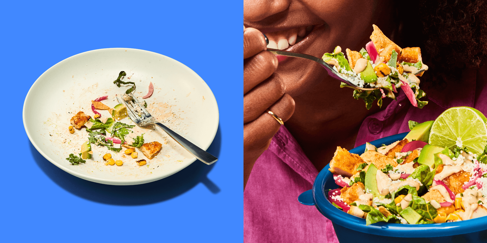
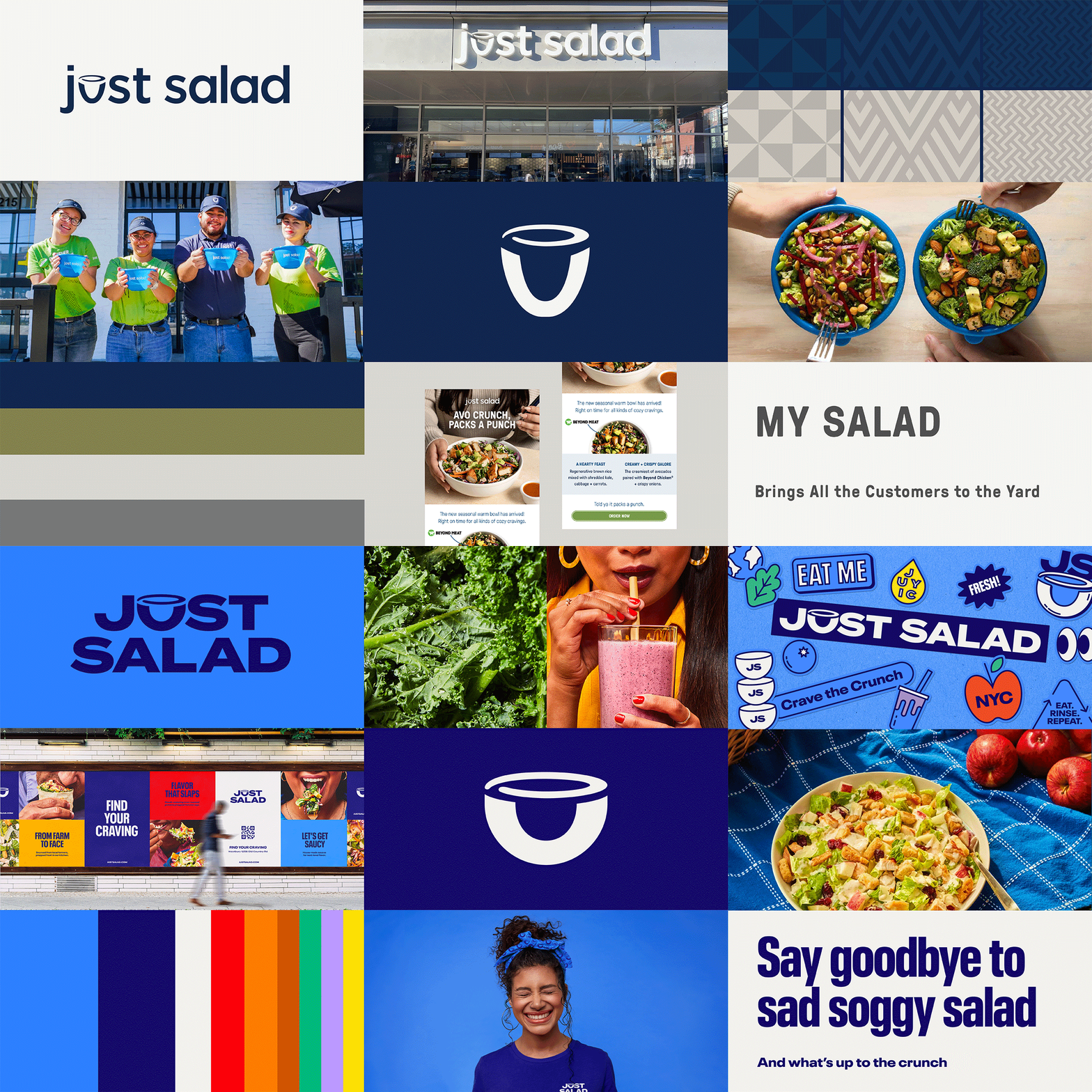
From the color palette to photography to iconography, every element of the design system was intentionally created to lead with flavor. Building on brand equity, we amped up the boldness in the logo and added more dynamic, vibrant, and differentiating colors to the palette. And we directed a product photoshoot to capture a library of mouth-watering photography featuring the full menu and lifestyle imagery to create desire, excite the senses and capture the crave.
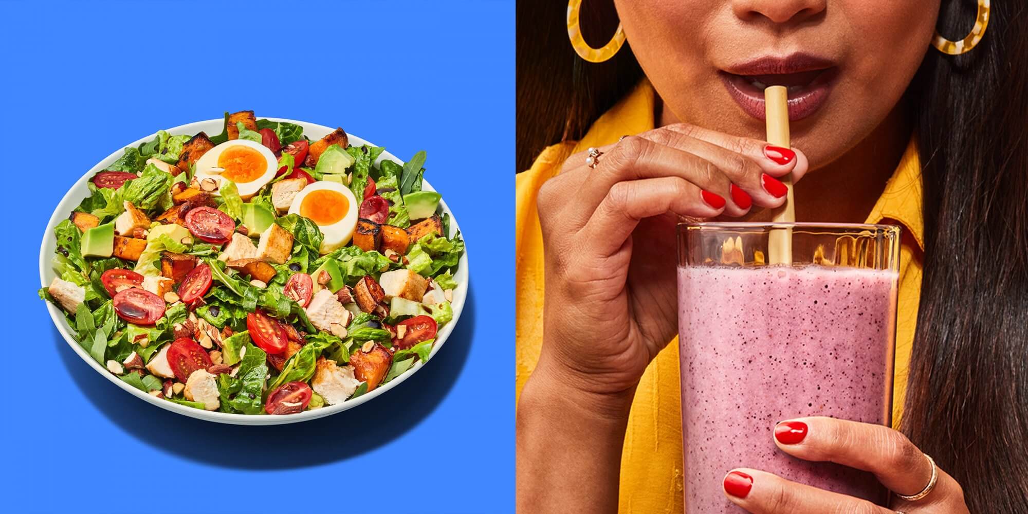
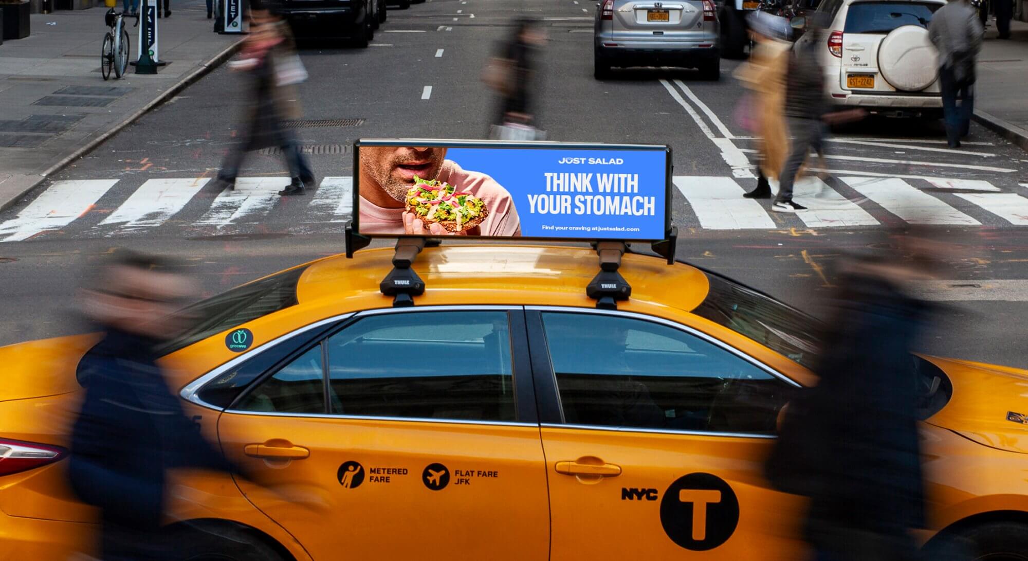
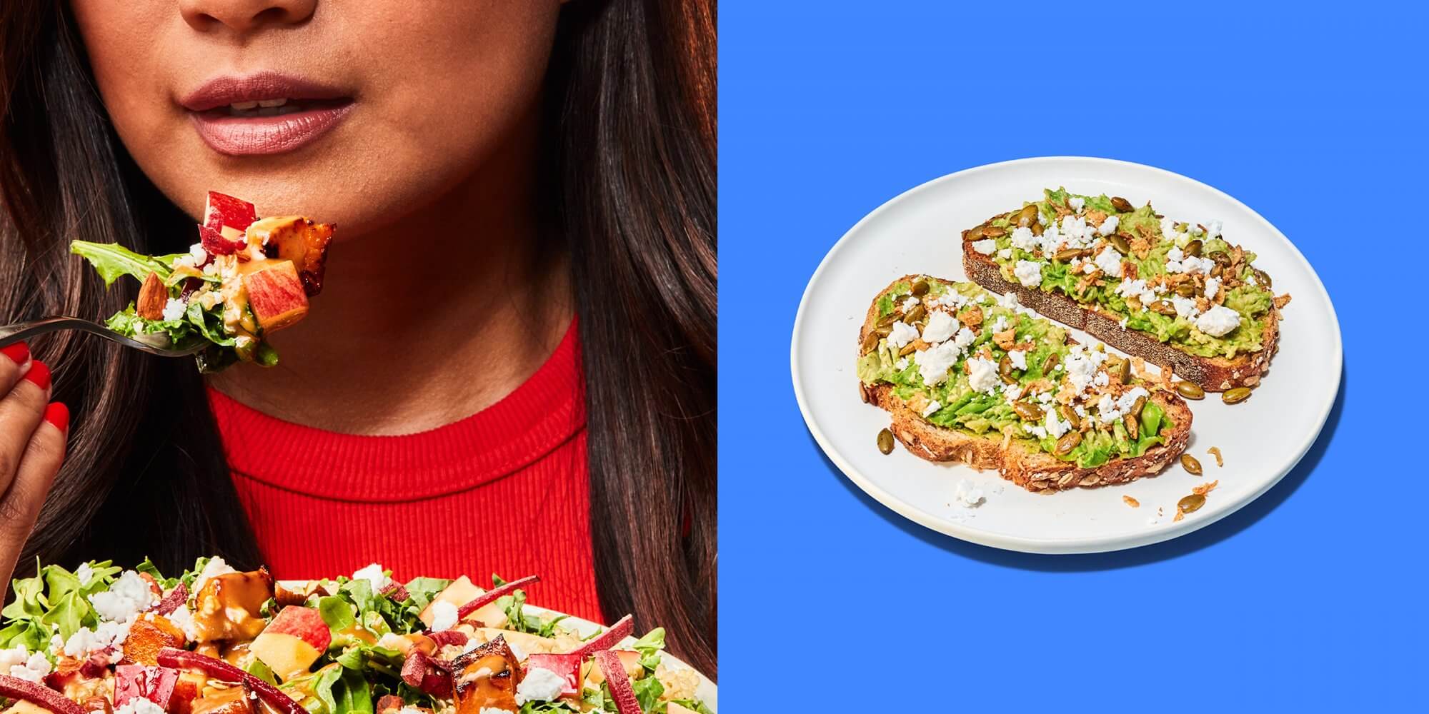
Bowl Licking Encouraged
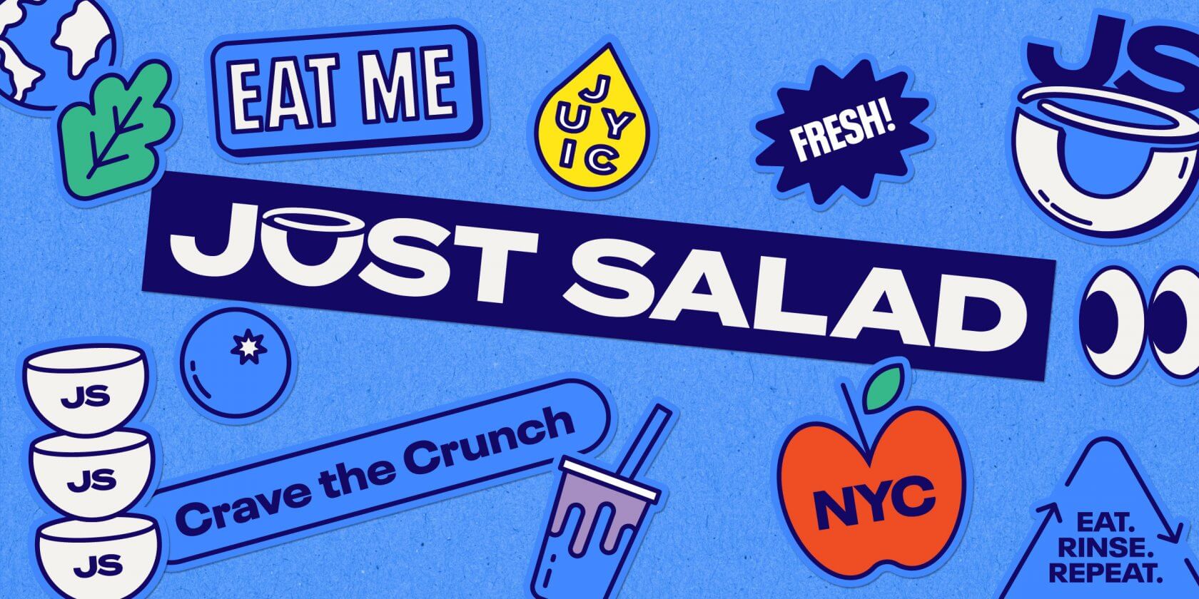
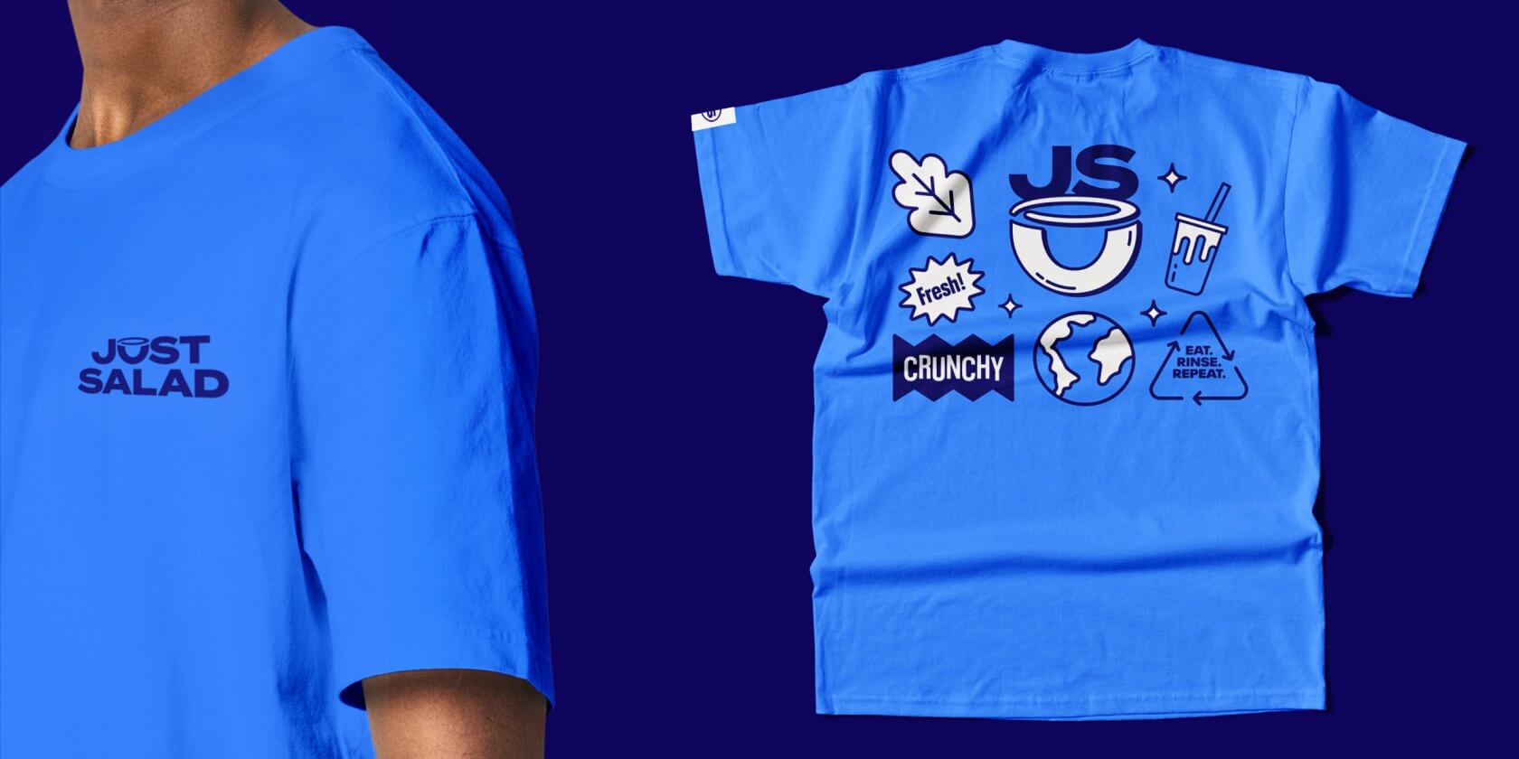
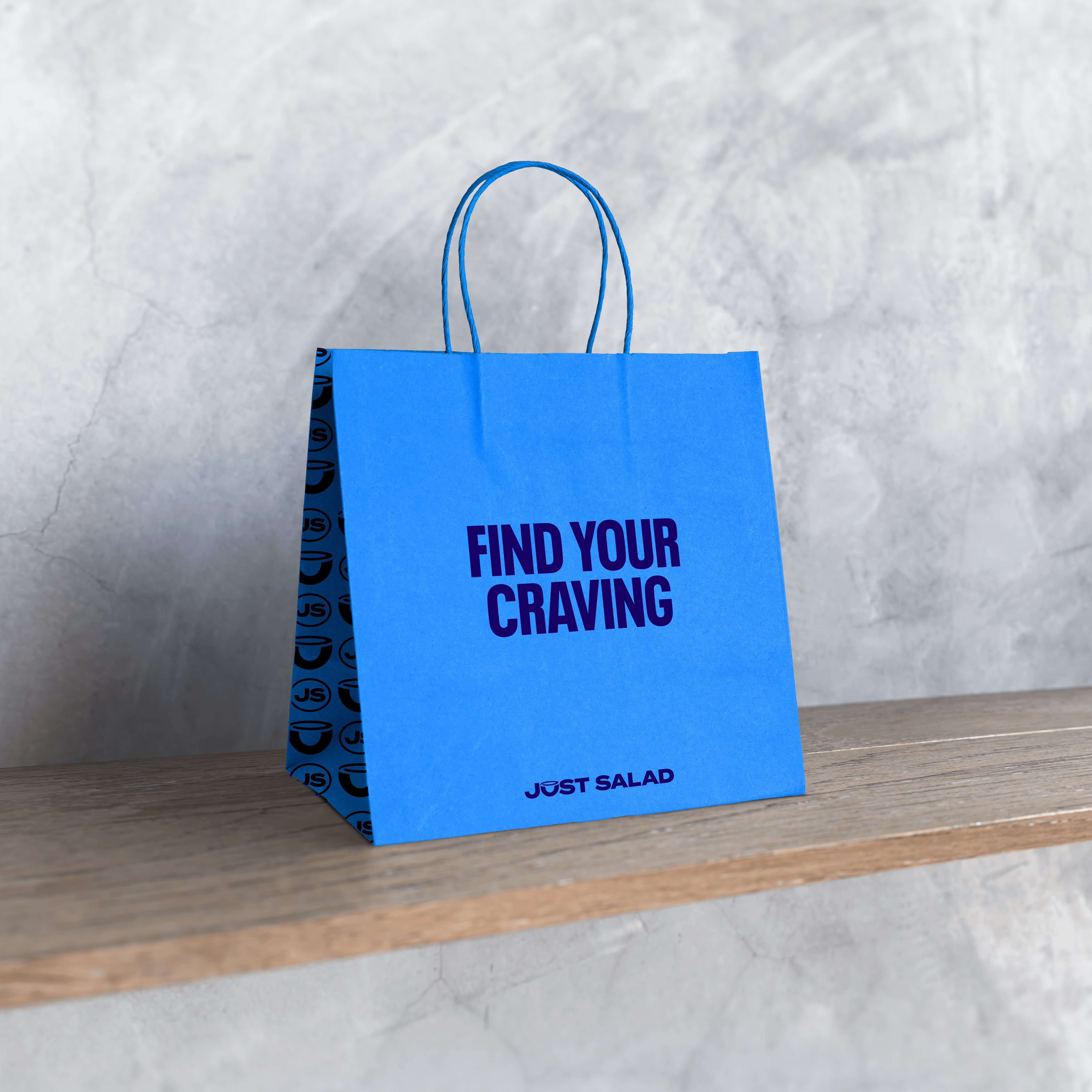
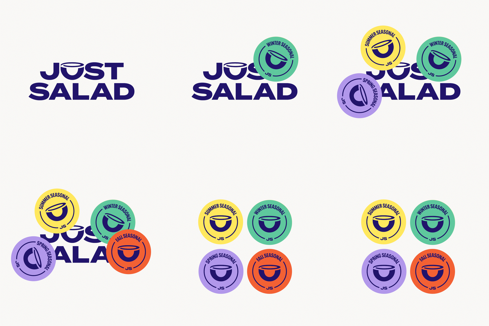
The new graphic language uses their iconic reusable bowl as a holding shape for a variety of applications so that their sustainability leadership is never far from mind. And we also created a library of expressive icons and stickers to inject energy and a little play. A comprehensive brand guide and assets were created to address a number of touchpoints — online, in-store, delivery, OOH, menus, uniforms— as well as a menu that really is much more than just salad.
Dressed to Impress
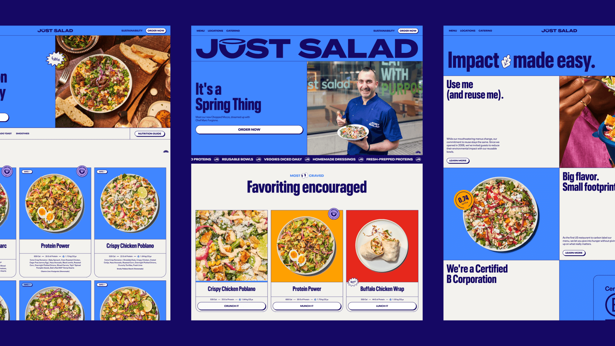
To launch the delicious new brand, we teamed up with Paper Tiger to write, design, and develop a bold and dynamic new digital home. The overall brand refresh is bolder and brighter, encapsulating Just Salad’s dedication to pushing the boundaries of flavor, sustainability, and service.
When we launched the new visual identity we received such great reactions to it! We are excited to highlight our commitment to great-tasting, earth-friendly food that is good for you in a bright, bold and exciting way. Thank you all for the amazing work.
