Arthur M. Blank Family Foundation
Come Together. Thrive Together.
For more than 25 years, the Arthur M. Blank Family Foundation has led by example, putting shared values into action. Started in 1995 by Arthur M. Blank, co-founder of The Home Depot, the foundation has granted more than $1 billion to causes across their five giving areas: youth development, democracy, mental health & well-being, the environment, and Atlanta’s Westside neighborhood.
With new leadership at the helm, an evolving strategy, a desire to unify efforts between Atlanta and Montana and high ambitions for new ways of collaborating, the foundation engaged BBMG to create a brand strategy, story and design experience that elegantly captures their vision of change, welcomes the partners and communities they hope to serve and inspires a new conversation about our fundamental interdependence and common humanity.
Audience Research
Brand Strategy
Brand Narrative
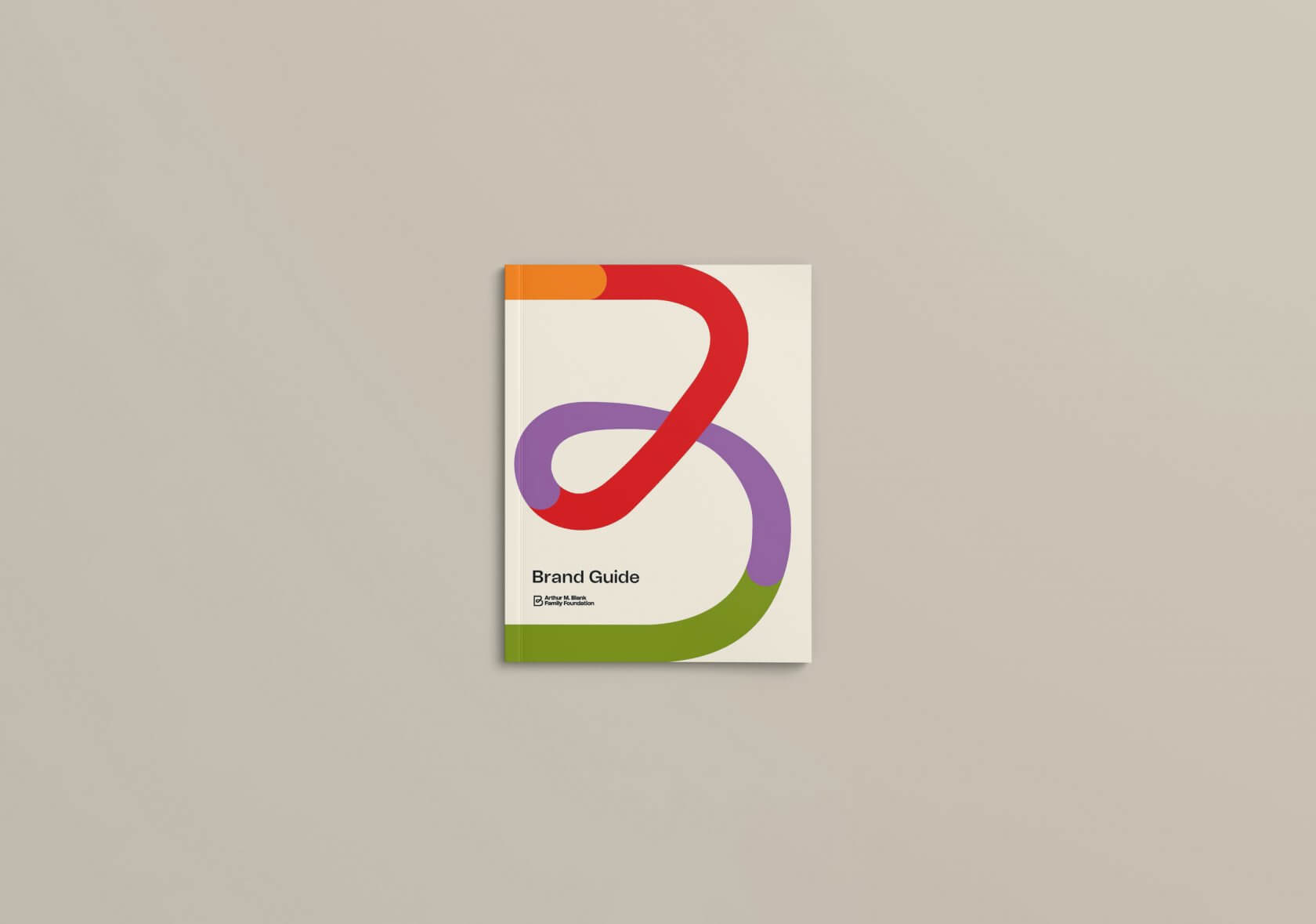
Brand Identity
The Power of And
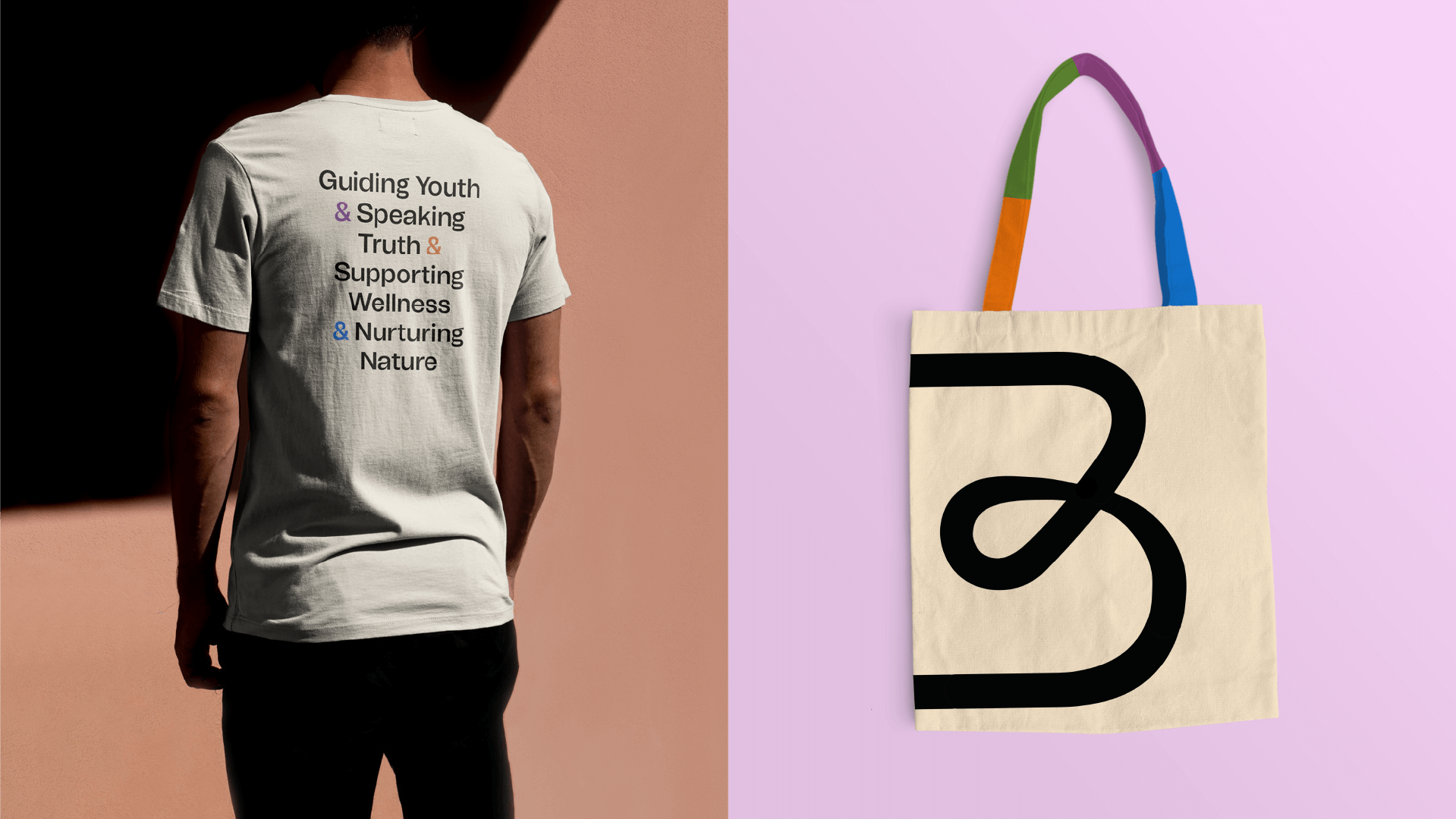
As we immersed ourselves in the foundation’s work, people and partners throughout their giving ecosystem, what emerged was the power of the word “and.” Far too often, we only see things one way. We dig in on one side and fear the other. But the Blank Foundation’s culture of welcoming difference and embracing pluralism are among its greatest strengths. They see the tenacity of togetherness. The promise of empowerment. And the creativity of contrast.
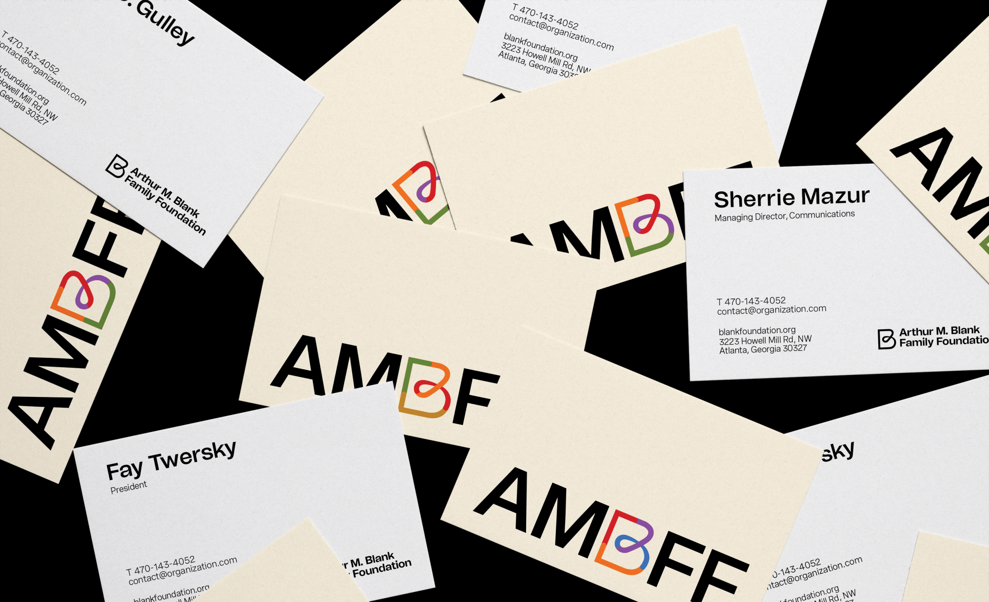
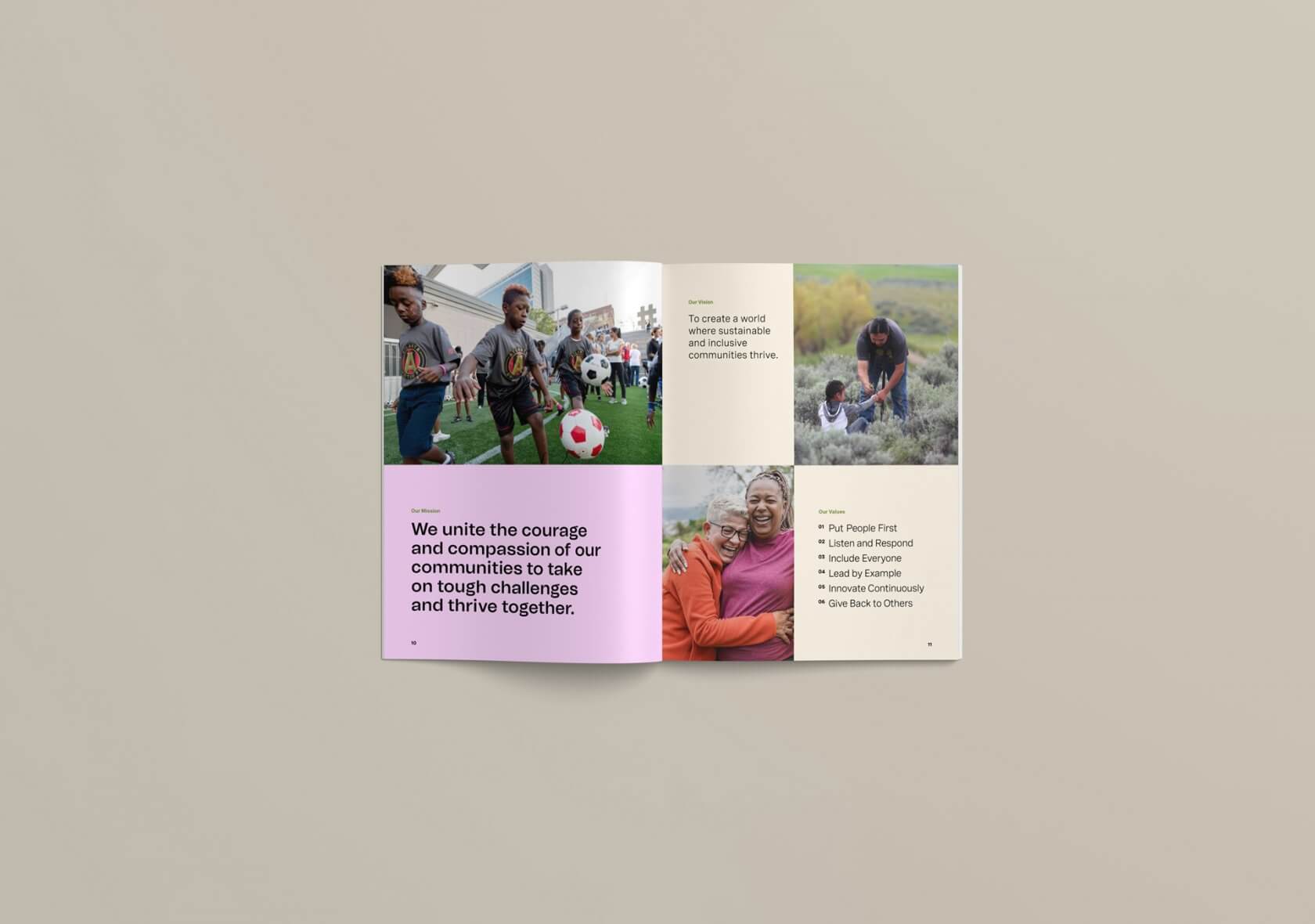
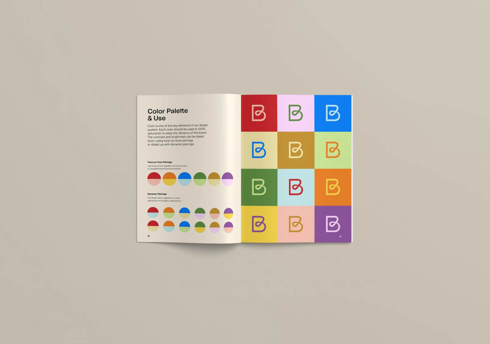
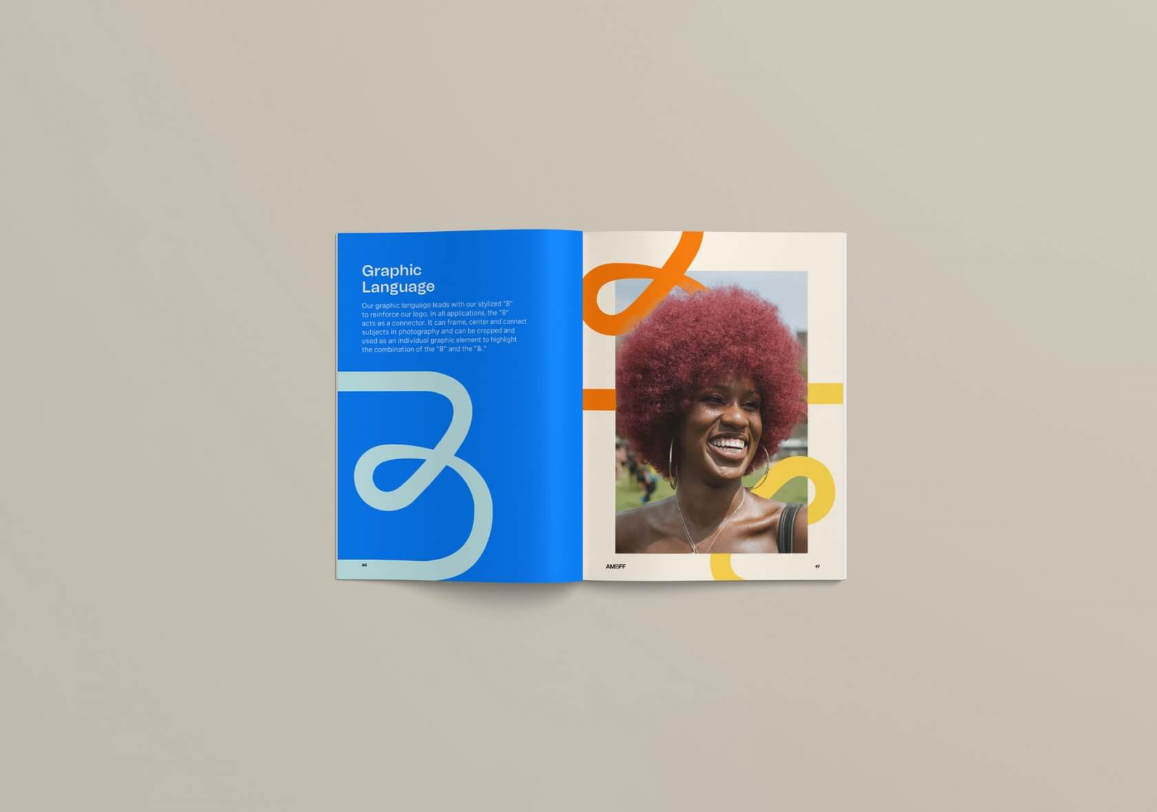
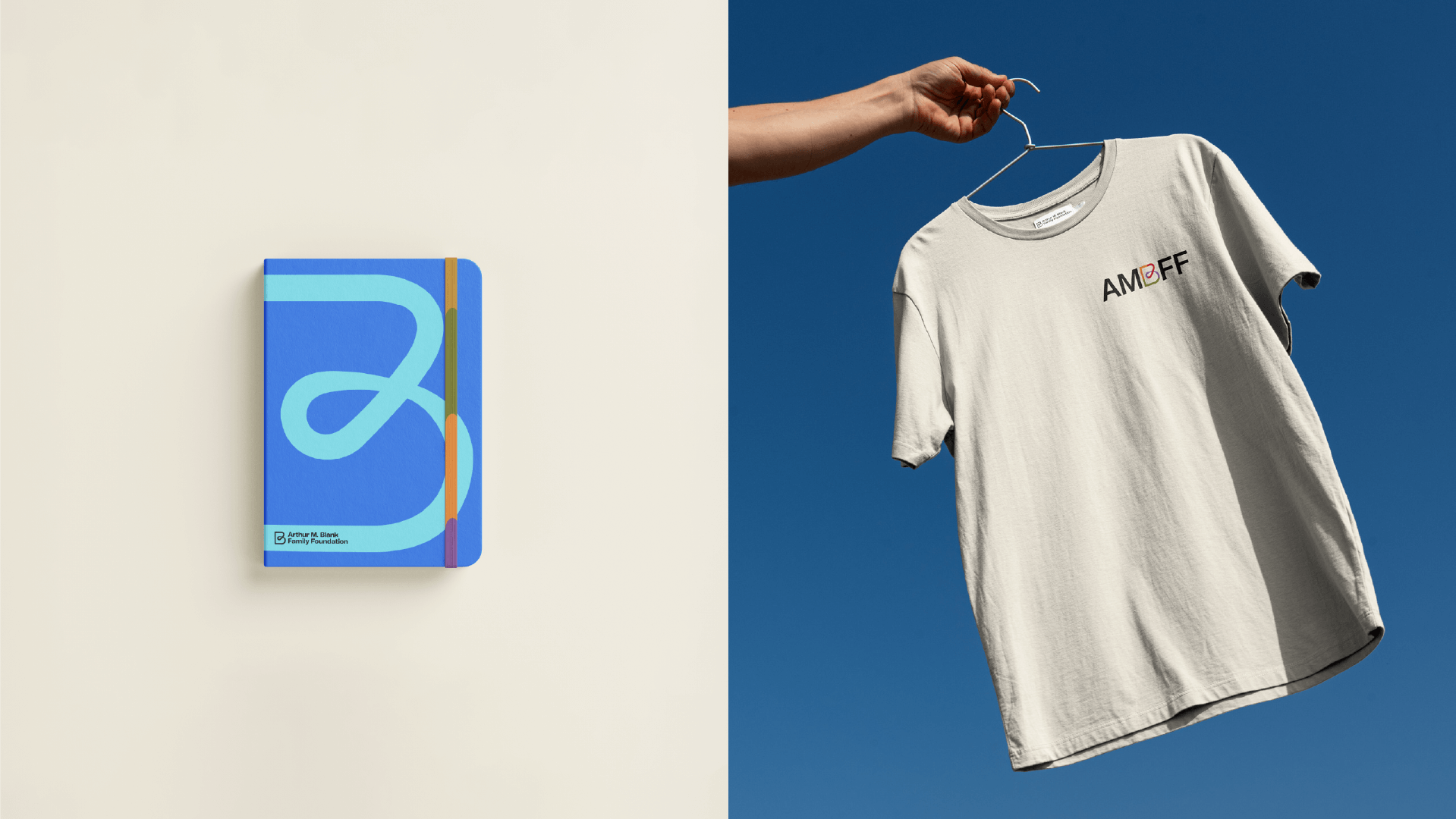
With new clarity on their mission to unite the courage and compassion of our communities to take on tough challenges and thrive together, we set out to create a fresh brand identity that honors the foundation’s history and values while bravely bringing their story of collective thriving to life. The new logo combines the letter “B” and an “&” with nods to the foundation’s previous emblem. It also symbolizes feedback loops—their way of listening and responding to the people at the heart of the work.
Visualizing Connection, Community, and Culture
The color palette is inspired by Atlanta and Montana, the foundation’s two headquarters. Dynamic color pairings add vibrancy to the brand design while welcoming the creativity of contrast.
We also defined a photography style that combines three themes to communicate and elevate collective thriving: connection – zooming into moments of togetherness, community – showcasing collaboration and working across differences and culture – celebrating and preserving culture and identity.
The BBMG team are true partners in every sense of the word. Their thoughtful research, close collaboration, strategic thinking and creativity not only breathed new life into our organization, but also provided a beautiful story to highlight our new mission.