Designing for Human Connection

A Look Inside the Rebrand of Einhorn Collaborative
It’s scary to change — to grow into a new moment, vision, chapter. It takes bravery, especially now, at a time that’s never felt more chaotic and confusing.
As a designer, part of my role is helping our clients navigate growth and change by developing a strong design perspective using tools like color, typography, and photography, things that some might consider icing on the cake. But good design can advance a new mission, vision, and strategy for the future like nothing else.
Design helps us go beyond words to create a feeling. It can make us smile, laugh, question, or shrink up our nose. It can definitely be subjective. And yet, that is also its strong point.
Design is emotional. It makes people feel.
So when BBMG partnered with the Einhorn Family Charitable Trust on their recent rebrand and the challenge was to visualize the power of empathy and human connection, we designed a process for the project that would lead us to a beautiful, emotional design system.
Here’s the story of our journey and how we’ve arrived at the new Einhorn Collaborative design.
Deep Listening
At its simplest, the job of design is to hold up a mirror and reveal the ideas and aspirations that are already there, while also imagining a world that is yet to be. So an essential part of our process — the very first part — is listening. We ask a lot of questions. Why do you work here? What drives you? Inspires you? What makes you proud? Then there’s another set of questions around our audience. Who are we trying to reach? What do we want them to think? How do we want them to feel? What do we want them to do?
In many ways, design is a practice of empathy — translating these stories, feelings and ideas into colors, images, and experiences. And we’re not talking about your favorite color being blue. We’re talking about a conceptual design idea that comes from truly getting at the soul of the organization. That’s why it’s so important to listen.
During this time with the whole Einhorn Collaborative team we also learned about hopes, fears, aspirations and hunches for the new brand.
Jenn shared how empathy and human connection allows us to see people and ourselves differently, revealing a bigger, brighter world. And Lucie shared an aspiration for a new brand that would convey beautiful energy.
Landing the Design Idea
With deep insight from the listening process, the next step is developing a concept — a visual metaphor and design idea that takes inspiration from both the team’s stories and the new vision of the organization and sets intentionality for the design system.
In the case of Einhorn Collaborative, the design idea was a Prism.
A Prism takes light in and turns it into a full spectrum of color.
A Prism unlocks new perspectives, invites you to see things differently.
A Prism delights.
A Prism transforms.
Inspired by a Prism, Einhorn Collaborative’s brand identity represents the transformative power of empathy and collaboration. When we move from welcoming one perspective to many, our worldview changes. We see things differently, new angles, dimensions, all in vivid color.
Building the Design System
Guided by insights around empathy, human connection, and the design concept of a Prism, we built a design system for Einhorn Collaborative that could reflect our individual perspectives and reveal our shared possibilities.
Here are five core elements we created together to bring the brand experience to life:
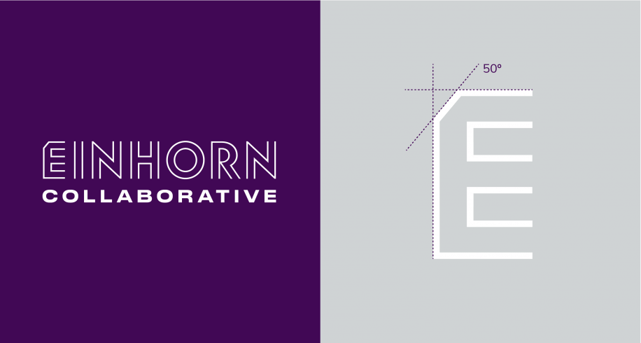
1) The logo is the foundation of our design system. It nods to the design concept while maintaining simplicity in order to communicate at a glance.

The cut in the ‘E’ is a subtle nod to the Prism, and ‘Einhorn’ has open geometric letterforms, letting the light shine through. ‘Collaborative’ is bold, strong, and extended, representing our community as our foundation.
2) The color palette breathes life into a brand. Color psychology and theory has long documented its effect on emotion and behavior.

Purple is the primary color, as it’s the deepest and last color in the spectrum. It also offers a softer, more welcoming alternative than black. It’s paired with prismatic gradients inspired by the full range of color Prisms create.
3) Photography tells stories (we’ve all heard “an image is worth a thousand words”) and creates an emotional connection to content.

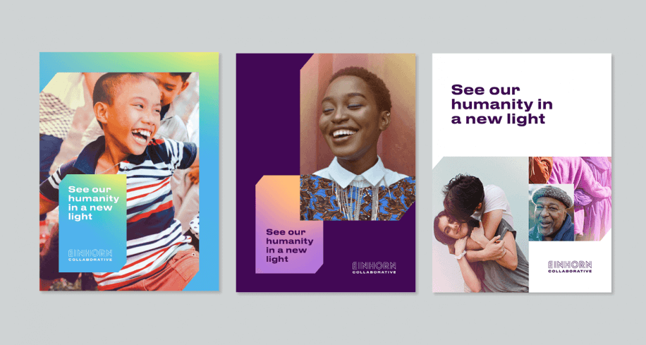
Photos have been selected to invite a new way of seeing by capturing different perspectives and elevating trust, belonging, and human connection. We also add an ’empathy filter,’ which injects every photo with brightness and color, painting a warm, colorful picture of what a world of empathy and collaboration looks like.
4) Graphic language and composition add dimension and structure, creating a consistent point of view on how color, imagery, and typography all play together.

The Prism shape has been simplified and interpreted as squares and rectangles with angled cuts that mimic the cut on the ‘E’ of the logo. When we combine multiple Prisms, we reveal a talk box in the negative space to signal connection, conversation, and community.
5) And personal touches always add a little something special — bringing the personality and humanity of the team forward.

For events, Einhorn Collaborative creates name tags with photos of participants when they were a child. It’s refreshingly human and always sparks a good conversation. It also turns out to be a good creative workaround for new portraits during COVID-19.
We’re proud of the work we created with the Einhorn Collaborative team — David, Jenn, Ira, Itai, Jonathan, Barbara, Lucie, and Nick. Collaboration always leads to better answers (a very true “Einhornism”).

The process we followed and the strong collaboration of our teams allowed us to tap into a design idea that helped everyone better see, understand, and communicate the organization’s vision for the future. You may like or dislike the design, but we hope that you can recognize its power. Because the design is more than just the story of Einhorn Collaborative, it’s the feeling of it, too.
For more on our work with Einhorn Collaborative, click here.
This post originally appeared on einhorncollaborative.org


